

This week, I want to cover something very specific: creating accessible color palettes to use with your maps. These can apply for any other diagrams as well. I am focusing on maps because these are such a mainstay in so many organizations - local governments, small businesses, larger organizations, and even hobbyists. The colors used on maps help people who are colorblind, have cognitive disabilities, or are low vision use and interact with a map. (Maps for people who are blind are worth an entire article on their own!)
For this newsletter, I am assuming that you use a common geographic information systems (GIS) software such as ArcGIS or QGIS. That said, this can apply for any map you make, even with an out-of-the-box application such as MapChart.
Color and Accessibility
When we talk about color and accessibility, we usually think of two things: contrast and distinction.
Contrast is the difference in brightness between two colors. For example, the contrast between the blue and white on the US flag is 16.04:1. This means that the blue absorbs 16.04 times more light than the white. This matters because many people with low vision cannot perceive slight differences in color. Contrast also helps people who are colorblind distinguish content in two colors that blend for them - for example, a dark blue and a light yellow will be easier than turquoise and mustard. Most standards expect that text and background should have a contrast of 4.5:1. For graphics, there is more flexibility. I will show you how to find colors that contrast a little further down.
Differentiation is being able to tell colors apart. This process develops for most people by the age of 3 or so. But many people with disabilities cannot distinguish between certain colors or any colors, even if they can see. And this gets me into my first tip.
Tip 1: Color Alone Is Not Enough
You need something beyond color for people to tell things apart. Many people who are color blind cannot distinguish certain pairs of colors, which appear roughly the same to them - if you are sighted. Many people with low vision also cannot distinguish between color or have no color vision at all, and see everything in gray scale. Some folks with cognitive disabilities also have difficulty in linking colors to other information that conveys meaning.
On maps, only using color can render a map useless for many disabled people. For example, this map that I created marking different cities around the US and Canada has two colors that distinguish them. Many color blind people or low vision people will see these dots as exactly the same:

(I engineered this map to also have many other problems. You can go back and see what else is an issue here after reading the rest of the article!)
So, you need something besides colors. There are three ways to do this. You can use patterns, text, or shapes:
You can overlay the colors with patterns - for example, green and a crosshatch. This works very well if you have a lot of shapes or polygons on your map, or tons of vector graphics. Here is an example with a map in France of the percentage of priests who refused to swear to the Civil Constitution in 1789 - credit to Mathias Hermans in Belgium for this map:

You can also mark things with text. This is preferred for maps that use a lot of dots or lines. My favorite example is how on airline route maps, you always see a blurb next to the dot that marks a city. You might know that Albuquerque is there, but not everyone does. Here is a fun map of all the cities Southwest Airlines served in 2016, from their magazine. Notice the high contrast and the labels for every city - including Albuquerque:

Southwest Airlines May 2016 route map - the printed versions are no longer available in a magazine! (Image from @AirlineMaps) If you ride transit a lot, you may notice that lines will often have “Green” or “Yellow” in text on the train, as well as something to mark the start and end of that line on a map - such as this example from Montreal (which use numbers and colors):

Map from the STM - This is the northern part of the central area of Montreal and the neighboring city of Longueuil. There are some other accessibility things I would change on these maps though: having the numbers run along the line in Montreal, and not using all-caps on either example.
If you are marking a lot of points on a map, you can also make the markers different shapes alongside different colors. Use text if you can, but if it is a map with a lot of data, that can make the map unreadable, so use your best judgment.


Tip 2: Red/Green and Blue/Yellow Are Nope
There are two color combinations I want you to be especially careful with. These are the two pairs of colors that are most commonly blended for people with various forms of colorblindness. They are:
Red and green. This is a doozy, since socially, we often use red and green for “bad” and “good.” But if you only use color, a lot of people will simply not pick up on it. This is a key reason why traffic lights are stacked and we have not switched to one changing light.
Accessibility in action: the green light is separate from the red light. Photo by Eliobed Suarez on Unsplash Blue and yellow, which is a less common but still very impactful form of color blindness.

Where possible, try to avoid just using these combinations, as the bar for misunderstanding can be especially high. I tend to like using green and brown, or blue and a gray or a burnt orange.
Tip 3: How To Choose Colors
There are three ways I recommend that you pick colors, in order of preference:
Use an existing color palette. If your workplace or organization already has a color palette used for accessibility reasons, just use that! Some places make their color palettes available for everyone - I like this example from the State of Missouri (PDF).
Use a color palette generator. There are some really great automated color palette generators out there. I really like Colorbrewer for maps, because it is designed specifically for GIS. Be sure to select “colorblind safe.” Venngage and the University of Sussex, in the UK, both have great palette generators too.
Pick colors you like from other maps. If another map has a color palette that strikes you as accessible, you can take it - but be sure to check that it meets the guidance outlined in this post. Generally speaking, though, actually getting the exact colors can be a bit time-consuming.
I usually stick with 1 and 2.
Tip 4: Do Not Use Too Many Colors
Limit yourself to 5 or 6 colors or hues, if possible. Most people begin to struggle beyond this point with distinguishing colors, with or without a disability. Highly complex color schemes are often particularly difficult for people who are colorblind or have dyslexia. Also, many people have headaches or other sensory issues triggered by many colors - especially if it is on an interactive tool, such as an ArcGIS StoryMap.
In addition, once you go above that number of colors, you may be hitting “too much information for one map.”
If you do need to go beyond 6 - say, for a data map with many different hues showing a concentration of something - really try not to go beyond 10 colors. In my experience, this is where things begin to become truly confusing. Even then, you can often tell the same story with fewer shades.
Tip 5: Use Contrasting Colors for Text
Color contrast is really important if there is text someone needs to read. Many folks who are colorblind or who have low vision cannot read text that does not contrast enough with the background. This also applies for anyone with vision-related changes arising from a health condition - for example, cataracts or glaucoma. In addition, low contrast between text and the background can trigger other issues for different people with disabilities as well - for example, headaches for people with migraine disorders.
Based on research, there are two levels of contrast that standards require for large text and small text. I suggest that you make it simple, and only use the stricter standard of 4.5:1, as this will make your design choices much easier. Note that logos do not have to meet this standard. This contrast is really only for text on a background, but you may find it helpful for other things as well - for example, icons that accompany text on legends.
There are some great contrast checkers out there. I personally find that WebAIM has the most reliable, intuitive checker if you just need to check two colors. If you need more colors, the University of Sussex palette generator I linked above is also very helpful. You may also want to download TPGi’s contrast analyzer software, which does not rely on internet access. Some design software and tools also check contrast - for example, Ceemo, who helped me with the marketing for OHA, had a checker embedded in their color generator.
You will need to get the hex codes for your colors. You can do so with the contrast analyzer software, or from the color palette generator. Pro-tip: white is #FFFFFF, and black is #000000.
Tip 6: Offer a Text Alternative
Even the most accessible map will not be usable by everyone. Some people cannot see. Other people, especially folks with certain cognitive disabilities, have trouble connecting images to information, and rely on text for information. (This is especially common for autistic people and people with early-stage dementia). So, where possible, you will need to provide a text alternative.
Your alternative will depend on the data. If there are a lot of numbers and comparisons involved, or just a lot of information, a table is probably best. (Learn more about accessible tables here.) Most GIS software makes it very easy for you to generate an accessible table that you can link on the site. Many local governments have such a feature embedded in their instance of a public map software.
For a more general map, you may want a text description. I am including an example of such a description in the caption below, for a simple map I found on the internet. (I would change the colors, too.) That said, if you are using ArcGIS or QGIS, you may already be able to generate a table.

Want to Learn More?
Remember that you can always book an appointment to learn more about OHA’s services on the website.
Opossum House Updates
Now, for my update!
First: I was going to originally talk about a messy run-in I had with someone at a happy hour two weeks ago. This person, after finding out what I do and that I had a disability, decided to go on a personally directed screed about why she thought accessibility was not important - including personally directed commentary! I kept my cool and notified the events organizers later - boorish behavior is something that is best dealt with by the organizers. Some battles are not worth fighting, and no amount of challenging or advocacy was going to change her mind. (It could very well do the opposite.) That said, as I kept writing, I decided that this would be giving this person way too much airtime. So, I will keep it at this bullet. The lesson here is: sometimes, it is bravest to not respond to something, and instead to suffocate the status-seeking behavior that is being “contrarian.”*
But there is tons of good news:
I was certified by the National LGBT Chamber of Commerce as a Certified LGBT-Owned Business, which provides access to so many corporate and local government procurement opportunities, and networking with many other organizations! I am excited to “dig in” to building relationships with the LGBT business community.
I published a piece for Greater Greater Washington on public restrooms availability and accessibility - check it out!
I will be at the Maryland Association of Counties conference in Ocean City next week, making connections, selling my wares, and trying to meet folks from all 24 counties and 140 municipalities in our fair state. Let me know if you will be there!
One of my clients said something offhand that I think was very astute: a good project plan is one in which you do not have to worry too much about the structure of how it works. This will be the theme of a coming newsletter!
Another potential client reminded me of an excellent tool for anyone who writes content in Spanish - the Fernandez-Huerta Index/8, which measures the readability of written material by how many years of schooling someone would need. For accessibility and readability, I usually go for 6-8 years of schooling in any language. You can learn more about the tool here.
I also have been at some lovely events, meeting with folks from around the region! I attended a celebration of the anniversary of the ADA and disability work in Maryland in Laurel, sponsored by the Maryland Department of Disabilities. They had some really great showcases of different accessible technology initiatives across the state - here is a table filled with fantastic Braille readers.
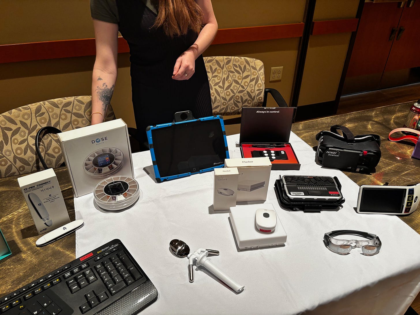
Braille readers and other assistive technology (MDOD) I also attended a very nice event with Disability:IN DC Metro, where we all got to hear from the esteemed Frances West, who has built much of the infrastructure helping people link accessibility and business. It was great to meet and interact with other disabled entrepreneurs, too.
That is all for this week! See you soon,
Jonathan Katz-Ouziel
*For a really great discussion of status-seeking and “telling truths,” “being contrarian,” “speaking truth to power,” or “not being a snowflake,” check out Nation of Rebels by Andrew Potter and Joseph Heath. While the book, from twenty years ago, is about consumer culture, the discussion is really the best out there about how many performances of “not being the norm” - on the left and right - are really about bolstering one’s status!
